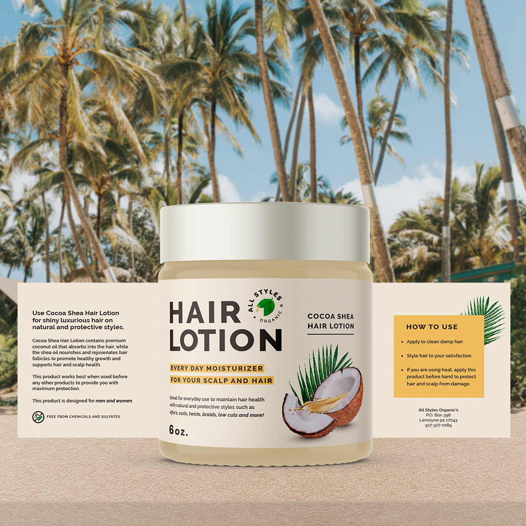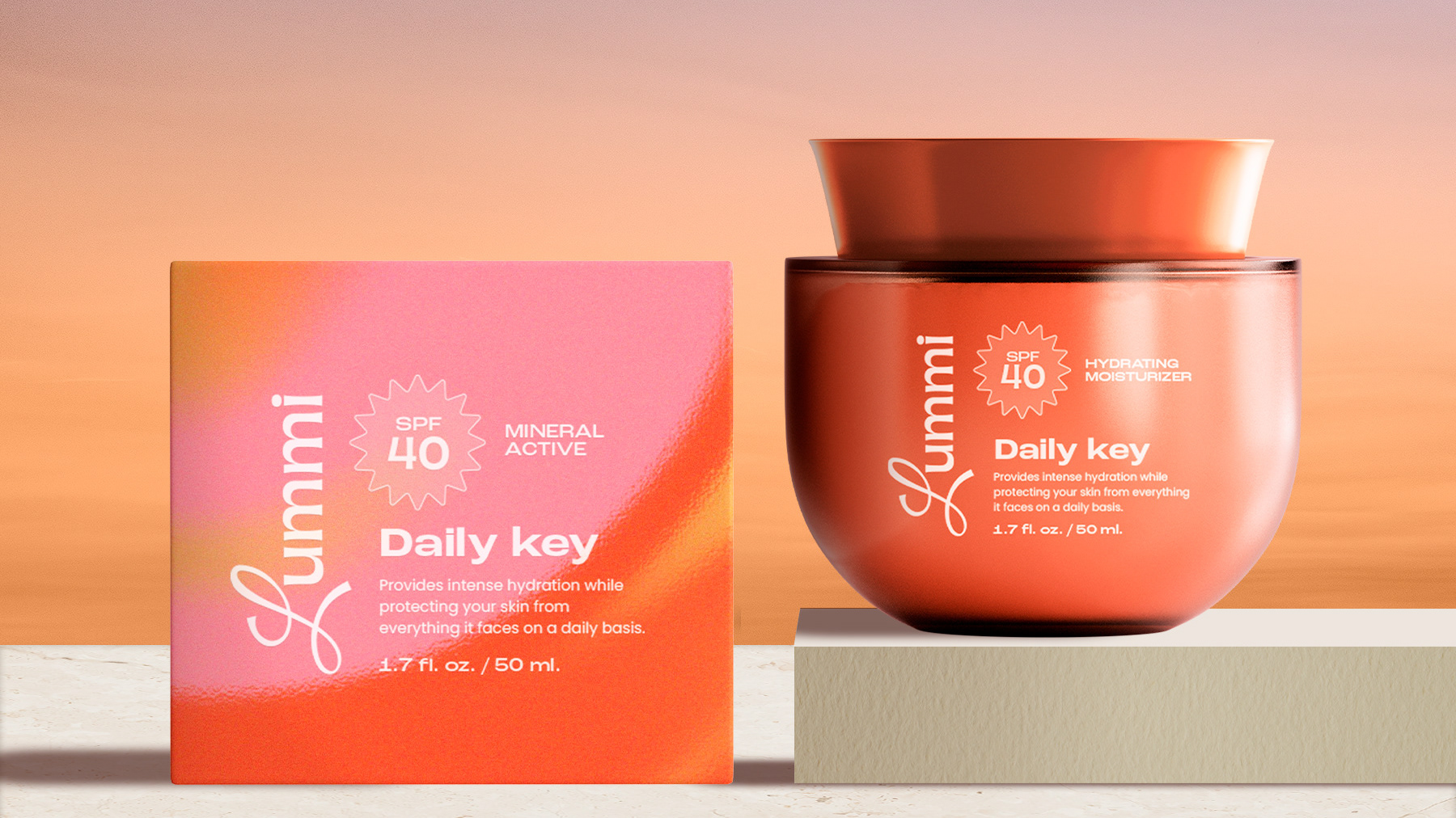
Packaging design for a client that I appreciate! 🥰
Personally, when I'm looking at self-care products I take the time to read the content, the ingredients and the "how to use" steps. This is why I consider it crucial to use different levels of reading to ensure that the information is organized when designing labels for products. Typography plays a key role to achieve this. It is also important to take advantage of the front of the label to highlight the name and the qualities of the product, in this way the consumer can have a quick view to know what she/he is about to buy. 👌🏼